Internal · Brand kit
Everything Fruta Madre.
The whole brand in one place — logo, colors, type, stickers, photography, and print collateral. Keep it juicy, keep it consistent.
Logo & wordmark

Primary lockup on Cream
Reversed on Leaf
Mark only — favicons, avatars, stamps
Color palette
Warm cream paper, ink outlines, and produce-aisle brights.
#FFF6EC #FFFDF8 #33251C #FF7A29 #E85D10 #E23D7B #C22A63 #FFC93C #7CB342 #2E5D3A Typography
Display · Fraunces
Sweet spots & juicy moves
Weights 700–900 for headlines. Tight leading, generous size.
Body & UI · Outfit
Clean, rounded, friendly. Used for body copy, buttons, labels, and anything that has to work hard at small sizes. Bold for emphasis, uppercase with tracking for eyebrows.
The sticker set
Hand-drawn SVG fruit — every service area gets its own mascot. 3px ink outlines, flat fills, always slightly tilted.
Voice & taglines
Warm, quick, pun-forward — but always anchored by 15 years of real expertise. One pun per breath, maximum.
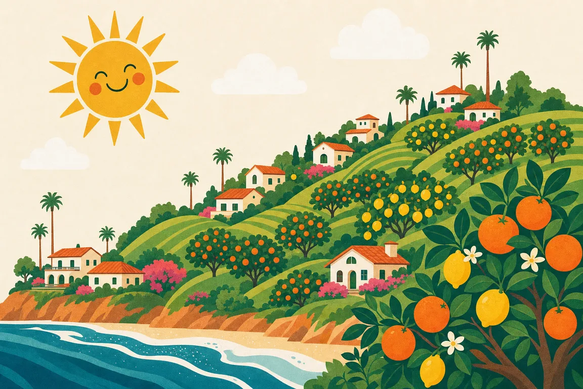
Photography & illustration


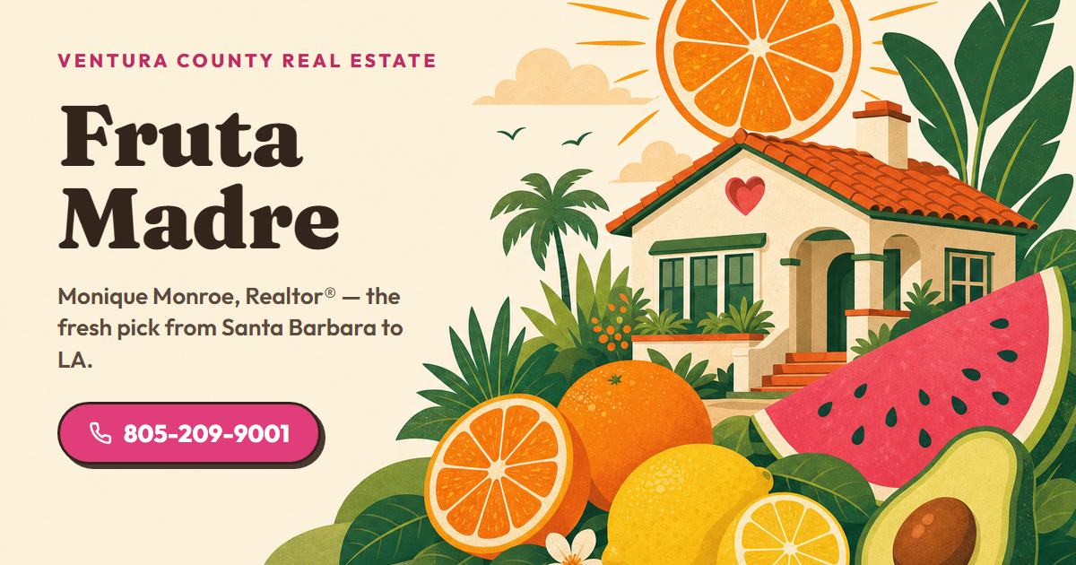
Social share card
Served automatically on every page via Open Graph. 1200×630.
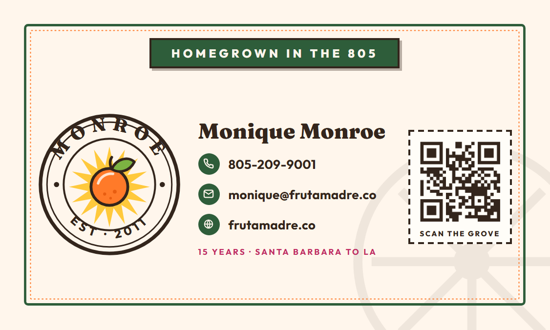
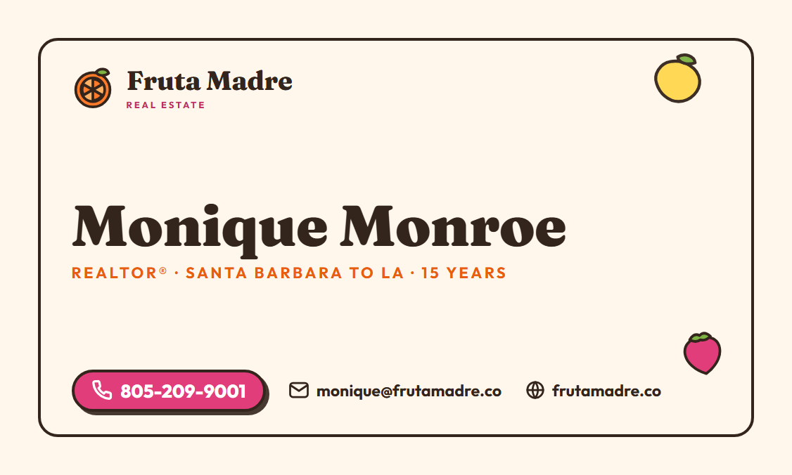
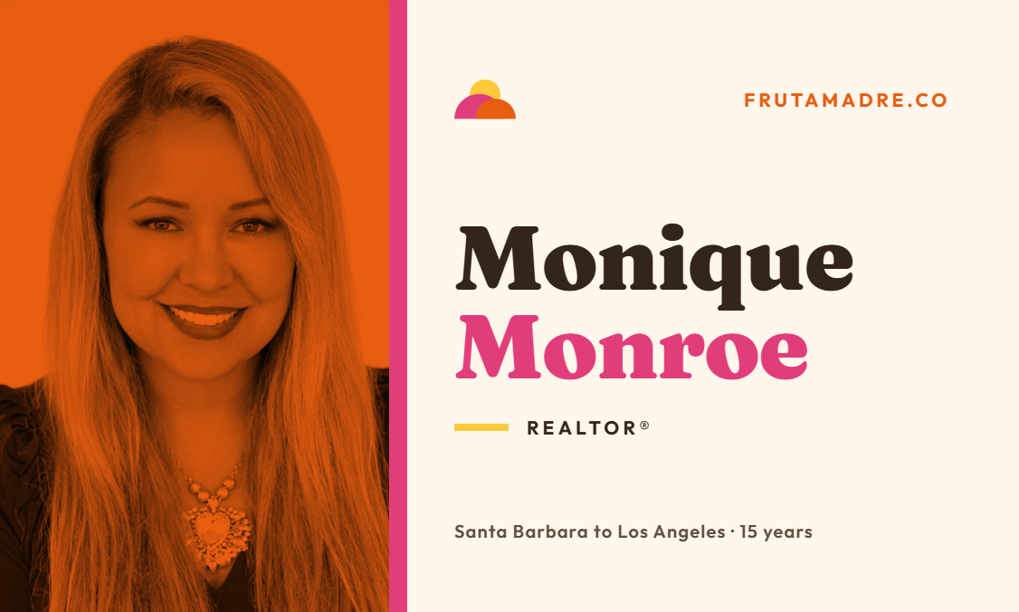
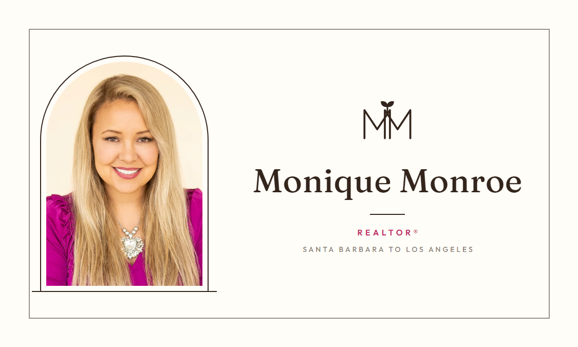
Business cards
The official card — vintage citrus-crate label with the Monroe grove seal. Print-ready at 300 DPI: canvas is 3.75×2.25” with bleed, trims to a standard 3.5×2” card. QR on the back points to frutamadre.co.
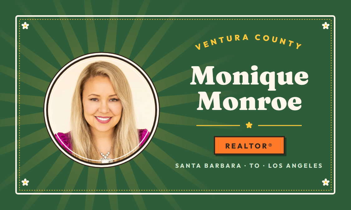
Runner-up concepts
Explored and set aside — kept here for the record (full pairs in
/assets/brand/concepts/).
The details, always the same
Monique Monroe · Realtor® · 805-209-9001 · monique@frutamadre.co · frutamadre.co